Evidently, color experts think we’re all stressed out and just need to chill, by surrounding ourselves with colors that are soothing and calming … and pale. So, so pale.
As proof, just look to the colors that different paint companies named as their color of the year for 2016: Benjamin Moore selected Simply White (OC-117); Sherwin-Williams went with Alabaster (SW 7008). That’s right: white and white. Coincidence?
Benjamin Moore’s Simply White
Sherwin-Williams’ Alabaster
Then Sherwin-Williams upped the ante even further by declaring Unfussy Beige (SW 6043) as its February 2016 Color of the Month. Beige!
Sherwin-Williams Unfussy Beige
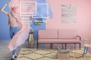
Meanwhile, the color experts at Pantone couldn’t decide on just one color of the year, so they went with two: Rose Quartz and Serenity, a soft pink and pastel blue straight from the walls of a baby nursery. Except Pantone wants us to take the colors out of the nursery and spread them to the grown-up spaces.
Like this:
Even House Beautiful magazine jumped on the bandwagon, with its March 2016 annual Color Issue. The issue was subtitled “Neutrals Now!” and featured such articles as “Who Says Beige is Boring?” and “The Simple Elegance of Cream.”
Don’t get me wrong. I do love a light, bright design, and I get the pristine appeal of an all-white room. Here’s a fantastic example from Benjamin Moore, highlighting their Simply White:
And here’s another:
So pretty. So calming. So soothing – especially when the starkness of the white is offset with those warm woods. But is it practical? Is it inviting? Can you picture yourself hanging out with your family and friends in a white, white room?
I personally prefer lots happy, peppy color to offset a white design. Benjamin Moore offers up this example, featuring its Enchanted (2070-50) together with Simply White:
Unfortunately, in our cloudy climate, blues that appear cool and serene in a bright, sunny space can quickly skew toward cold and icy. The same is true of many cool-toned whites. On the other hand, the right white, with the right accent colors, can provide a mood-lifting counterpoint to our dreary, gray days.
So what do you think? Are you ready to enter the neutral zone? Give us a call! Color consultation is one of many services that we offer at Albee Interior Design — because, sometimes, updating your home can be as simple as replacing that tired old 1990s paint color with something new and fresh. Whether that means adding more color or taking some away is entirely up to you!